Contents
- Microsoft – MORE INFO
- Etch – MORE INFO
- Data Driven London – MORE INFO
- Combadi – MORE INFO
- SuperEight Studio – MORE INFO
- Friends of the Web – MORE INFO
- Crafting Type – MORE INFO
- VT Creative – MORE INFO
- Squidee – MORE INFO
- Square Space – MORE INFO
- Lorenzo Verzini – MORE INFO
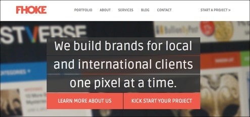
- Fhoke – MORE INFO
- Negative – MORE INFO
- Erik Ford – MORE INFO
- I Think I Might – MORE INFO
- FlatIcons – MORE INFO
- Build – MORE INFO
- Profound Grid – MORE INFO
- Wistia – MORE INFO
- Mark Simonson – MORE INFO
- Shane Harris – MORE INFO
- WinRumors – MORE INFO
- January Creative – MORE INFO
- Jake Giltsoff – MORE INFO
- Ivo Mynttinen – MORE INFO
- William Leeks – MORE INFO
- The Ecology Center – MORE INFO
- Spell Tower – MORE INFO
- OnSite – MORE INFO
- LayerVault – MORE INFO
- Its a Shape Christmas – MORE INFO
- Oak – MORE INFO
- Invoisse – MORE INFO
- Foundation – MORE INFO
- Designed to Move – MORE INFO
- Belancio – MORE INFO
- Lazy Made – MORE INFO
- Inky – MORE INFO
- Fitbit – MORE INFO
- Sumall – MORE INFO
- Snowbird – MORE INFO
- Coder Wall – MORE INFO
- Werkpress – MORE INFO
- Happy Studio – MORE INFO
- Bob Galmarini – MORE INFO
- Chris Lee – MORE INFO
- Benetton – MORE INFO
Flat web design is a real trend buster right now, and this comes with good reason!
Not that long ago the use of 3D effects, textured surfaces, light and gradient effects were trending elements in web design. However, with the changing times so comes new trends within web design.
The tendency right now leans towards simple web design layouts that especially Microsoft’s Metro interface is a famous example of. The use of simple, flat and typographical design elements such as high contrast colors, square corners and straight lines has become essential elements today. These simple, yet powerful elements of flat web design allow web designers to build website that focus solely on the content. Using these simple flat design elements makes it easy for visitors to read and interact with the content.
For this post, I have found some excellent examples on how different web designers have used flat web design. When browsing this collection you might find inspiration for new elements in your own designs. Either way I hope you will find this collection inspiring and helpful in your web design process. Enjoy!
[exec]$filestr = file_get_contents(‘http://www.tripwiremagazine.com/googleadsensebelowmoretag.inc’);echo $filestr;[/exec]
Microsoft – MORE INFO
Etch – MORE INFO
Data Driven London – MORE INFO
Combadi – MORE INFO
SuperEight Studio – MORE INFO
Friends of the Web – MORE INFO
Crafting Type – MORE INFO
VT Creative – MORE INFO
Squidee – MORE INFO
Square Space – MORE INFO
Lorenzo Verzini – MORE INFO
Fhoke – MORE INFO
Negative – MORE INFO
Erik Ford – MORE INFO
I Think I Might – MORE INFO
FlatIcons – MORE INFO
Build – MORE INFO
Profound Grid – MORE INFO
Wistia – MORE INFO
Mark Simonson – MORE INFO
Shane Harris – MORE INFO
WinRumors – MORE INFO
January Creative – MORE INFO
Jake Giltsoff – MORE INFO
Ivo Mynttinen – MORE INFO
William Leeks – MORE INFO
The Ecology Center – MORE INFO
Spell Tower – MORE INFO
OnSite – MORE INFO
LayerVault – MORE INFO
Its a Shape Christmas – MORE INFO
Oak – MORE INFO
Invoisse – MORE INFO
Foundation – MORE INFO
Designed to Move – MORE INFO
Belancio – MORE INFO
Lazy Made – MORE INFO
Inky – MORE INFO
Fitbit – MORE INFO
Sumall – MORE INFO
Snowbird – MORE INFO
Coder Wall – MORE INFO
Werkpress – MORE INFO
Happy Studio – MORE INFO
Bob Galmarini – MORE INFO
Chris Lee – MORE INFO
Benetton – MORE INFO
Lars is passionate about web design, web development, SEO, social media and loves to look into new technologies, techniques, tools etc. and to write articles for tripwire magazine readers.


I think that “Happy Studio” theme would work best for my website.