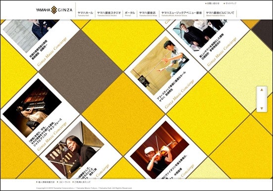
Diagonal website designs or parallax scrolling websites challenges today’s very popular grid-based layouts adding a visually different approach to web design going against the traditional horizontal and vertical flow. A diagonal line design breaks with the rule of thumb drawing the attention of visitors away from the main content just enough to make them notice the atypical layout.
Some websites emphasize on using large typography and a few simple diagonal lines to make a simple yet eye-catching design while others use a symmetric design of diagonal lines or boxes giving a more balanced layout that tends to make a more user friendly experience leading visitor attention to content and navigation in a natural way. Some look a bit chaotic breaking with the clean and minimalistic trends seen in web design in 2011/12. This can work if done in a way where user experience and site navigation are not sacrificed for a sleek and confusing design. If there are too many things going on and users don’t have a clear view of how to navigate the site visitors will quickly loose interest and leave.
As with typography, colors play a significant role in web design and can work wonders if complementing the overall site layout and design without disturbing user attention and experience. Some of the examples of diagonal website designs listed below have a nice balance between design, layout and colors making navigation intuitive and easy whilst looking great and out of the ordinary. Used thoughtfully a diagonal website design catches the attention of visitors making it more memorable and could potentially get people to stay on your site for longer. The diagonal design approach is not that common but it is a great way to stand out. Therefore it is often creative portfolios that use the effect. For inspiration on setting up an online portfolio I recommend you take a look at WordPress. There are so many cool portfolio themes available you can use as inspiration. Check out this post for more inspiration on this topic.
In this article we’re sharing with you a sizable collection of diagonal website design and hope there is something that will be of inspiration to your future work. If you like it please share this post with others using our social media partners.
[exec]$filestr = file_get_contents(‘http://www.tripwiremagazine.com/googleadsensebelowmoretag.inc’);echo $filestr;[/exec]
Yamaha

Whyinteractive
Badminton-center

Arnaudbeelen

bloedoranjegallery

Carterdigital

Piropixel
![]()
Wixel

Skidpasset

Neotokio

Kikk

Designergleb

Unfold

Ethanmarcotte

Truly-design
Bleepradio

Fusionroom

Davidkopec

Olivers

Tympanus

Vonchurch

Carsten started writing for Tripwiremagazine in 2011 and is a blogger who likes to write about WordPress topics, web design, photography, blogging, new tech stuff, gadgets, gaming etc.


Great article over again! I am looking forward for your next post=)
Kikk is my favorite here. Professional, but still embracing the freedom of contemporary art.
very good design specially bloedoranjegallery
I know this ωebsite preѕеntѕ quality based aгticles οr reviews and extra material,
is there any other websitе whiсh pгesеnts theѕe
іnformаtion in quality?
If you are searching for creative inspiration, I will recommend you to go visit “Creative Can” http://www.creativecan.com 🙂
Best regards,
Sofie
[…] http://www.tripwiremagazine.com/2012/08/diagonal-website-design.html – 20+ inspirational examples of diagonal website design. […]
These website templates are great examples of how “tension” between the user’s paradigm and the unexpected can be entirely engaging! Bounce rate would drop considerably as users just look at the excitement on the screen. Great article!
What’s up to every one, the contents existing at this website are genuinely amazing for people knowledge, well, keep up the nice work fellows.
All are great design can get lot of good ideas from these design
good aticale for web site designer (website.lk)