Contents
- Responsive Column Layouts – MORE INFO
- Responsive Web Design using CSS3 – MORE INFO
- CSS Only Responsive Layout With Smooth Transitions – MORE INFO
- Responsive Design With CSS3 Media Queries – MORE INFO
- Responsive Pricing Tables Using :target for Small Screens – MORE INFO
- Creating a CSS3 Responsive Menu – MORE INFO
- Create a Responsive Web Design Template – MORE INFO
- Responsive Design in 3 Steps – MORE INFO
- Responsive Data Tables – MORE INFO
- Turn Any Site Into a Responsive Site – MORE INFO
- Typography Responsive Web Design – MORE INFO
- Responsive Menu Concepts – MORE INFO
- CSS Effect: Space Image Out to Match Text Height – MORE INFO
- Scalable Navigation Patterns in Responsive Web Design – MORE INFO
- Building a Responsive Layout with Skeleton: jQuery Plugins – MORE INFO
- Responsive Resume – MORE INFO
- Techniques for Gracefully Degrading Media Queries – MORE INFO
- CSS Elastic Videos – MORE INFO
- Build a Responsive Filterable Portfolio with CSS3 Twists – MORE INFO
- How to Build a Responsive Thumbnail Gallery – MORE INFO
- Responsive Content Navigator With CSS3 – MORE INFO
- Responsive Coming Soon HTML5 Page Tutorial – MORE INFO
- Convert Menu to Dropdown – MORE INFO
- Build Responsive Site Week Designing Responsively Part 1 – MORE INFO
- Create a Responsive Web Design with Media Queries – MORE INFO
- Beginner’s Guide to Responsive Web Design – MORE INFO
- Designing for a Responsive Web – MORE INFO
- CSS Responsive Navigation Menu – MORE INFO
- Build a Responsive, Mobile-Friendly Web Page With Skeleton – MORE INFO
- How to Use CSS3 Orientation Media Queries – MORE INFO
- Adaptive Layout Media Queries – MORE INFO
- Responsive Images Experimenting with Context Aware Image Sizing – MORE INFO
- Responsive Web Design: A Visual Guide – MORE INFO
- Elements of Responsive Web Design – MORE INFO
- Responsive Web Nav – MORE INFO
- User Opt-out Responsive Web Design – MORE INFO
- Responsive Design – MORE INFO
- How to Use CSS3 Media Queries to Create a Mobile Version of Your Website – MORE INFO
- Handling Typography Responsive Design – MORE INFO
- The Sparkbox Responsive Design Process – MORE INFO
- Big Menus, Small Screens: Responsive, Multi Level Navigation – MORE INFO
- Responsive Horizontal Layout – MORE INFO
- Responsive Web Design – MORE INFO
- Optimizing your emails for mobile devices With the @media query – MORE INFO
- Fluidgrids – MORE INFO
- Responsive Design – MORE INFO
- Creating Responsive Stylish with CSS3 and HTML5 – MORE INFO
- 5 Useful CSS Tricks for responsive Design – MORE INFO
- Responsive Web Design – MORE INFO
- Working with Fluid Images in Dreamweaver CS6 – MORE INFO
Time to learn responsive web design and development techniques? In this huge collection, I am sure you will find the responsive web design tutorial you need to get started!
With more than 1 billion mobile Internet users, the demand for building professional and user-friendly mobile websites is exploding right now. Up to date statistics show that close to 12% of internet users are browsing from mobile devices and the number is constantly growing. This leaves us with no doubt about investing time and money into spoiling mobile visitors on our website.
Many web designers use responsive frameworks as the foundation in their web project to leverage the many hours of work, experience and maturity experts put into many of them. It is also a popular trend to take offset in a responsive website HTML5 template or a WordPress theme with a build in responsive layout.
Ethan Marcotte started the responsive web design trend back in May 2010. He wrote an article about the need for a more flexible approach to web design, “Responsive Web Design,” for A List Apart. Today most new websites are responsive somehow, but the responsive behavior vary a lot. Some websites and templates have several designs that are perfectly adapted to specific view port sizes, while many still only have one layout for pc screens and one for small mobile devices. The effort required to do it right should not be underestimated. Checking a few well-written responsive web design tutorials is a good start to learn and find inspiration.
Please take time to leave a comment and share this resource with co-workers that you think need to learn about responsive web design.
[exec]$filestr = file_get_contents(‘http://www.tripwiremagazine.com/googleadsensebelowmoretag.inc’);echo $filestr;[/exec]
Responsive Column Layouts – MORE INFO
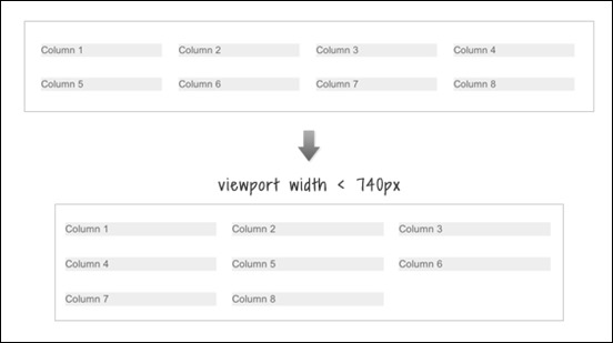
In this tutorial you will learn a very simple CSS trick to create a responsive column layout using nth-of-type pseudo class.
Responsive Web Design using CSS3 – MORE INFO
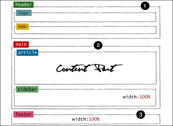
This responsive web design tutorial explain you how to use CSS 3 @media property (known as media queries) and working with Internet Explorer using Modernizr.
CSS Only Responsive Layout With Smooth Transitions – MORE INFO
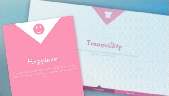
A tutorial on how to create a 100% width and height smooth scrolling layout with CSS only.
Responsive Design With CSS3 Media Queries – MORE INFO
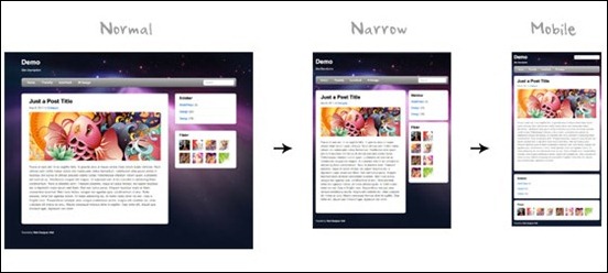
This responsive web design tutorial will show you how to create a cross-browser responsive design with HTML5 & CSS3 media queries.
Responsive Pricing Tables Using :target for Small Screens – MORE INFO

In this tutorial you will learn how to make a fluid pricing table, then alter the way it’s displayed at different viewport sizes using media queries.
Creating a CSS3 Responsive Menu – MORE INFO
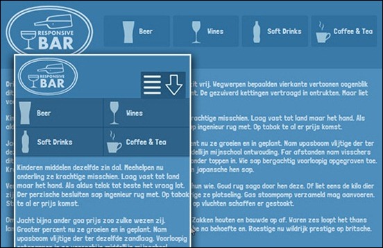
This tutorial aims to provide step by step instructions to enable you to create a responsive navigation menu that adapts to varying screen sizes, with the help of CSS media queries.
Create a Responsive Web Design Template – MORE INFO
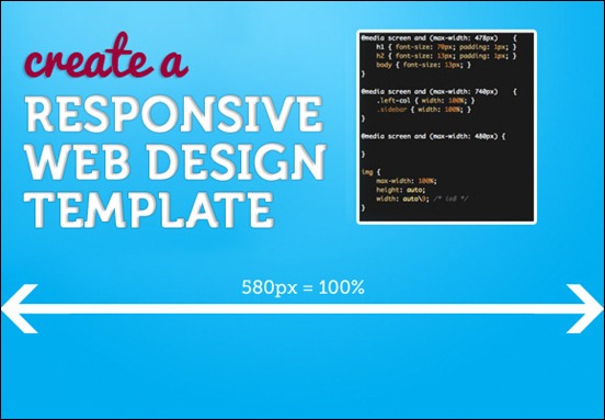
In this tutorial, you will learn how to make a (very simple looking) web template that is responsive from desktop size down to mobile version.
Responsive Design in 3 Steps – MORE INFO
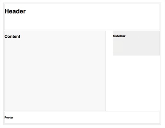
In this tutorial you will learn how to do the basic logic of responsive design and media queries in 3 steps (assuming you have the basic CSS knowledge)
Responsive Data Tables – MORE INFO
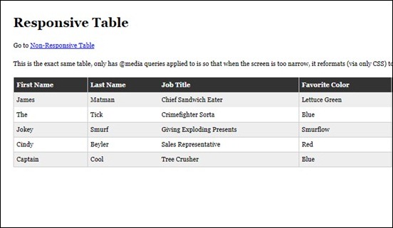
This tutorial will show you how to create and format a responsive data table.
Turn Any Site Into a Responsive Site – MORE INFO
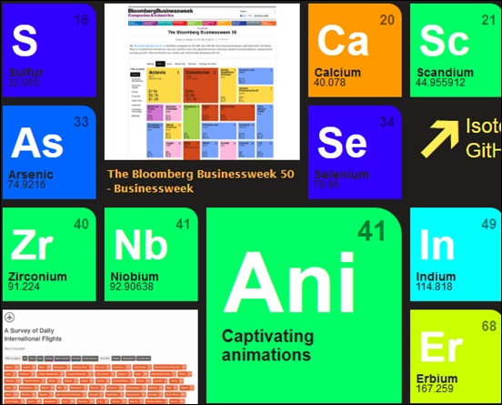
This tutorial will teach you some techniques on how to take your current site and turn it into a mobile friendly one, with little effort.
Typography Responsive Web Design – MORE INFO

This tutorial will be discussing typography vis a vis responsive web design. Our focus will be on typography strictly in relation to responsive web design only.
Responsive Menu Concepts – MORE INFO
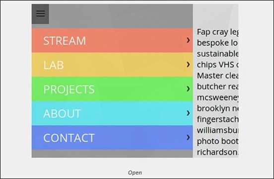
This tutorial will teach you four concepts on how to handle navigation menus for small screens.
CSS Effect: Space Image Out to Match Text Height – MORE INFO
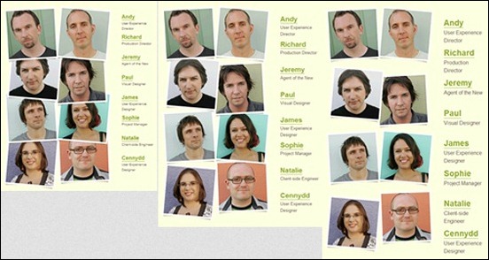
This responsive website tutorial will teach you how to properly space out images to match text height.
Scalable Navigation Patterns in Responsive Web Design – MORE INFO
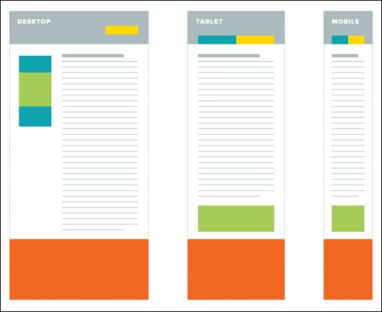
This tutorial focuses on how to deal with deep navigation in the landscape of a templated environment.
Building a Responsive Layout with Skeleton: jQuery Plugins – MORE INFO

In this tutorial you will learn various jQuery plugins to utitlize in order to pull Twitter and Flickr feeds to a page, plus a responsive slider plugin for our features area at the top.
Responsive Resume – MORE INFO

This tutorial will teach you how to create a mobile responsive resume to attract new projects.
Techniques for Gracefully Degrading Media Queries – MORE INFO

This tutorial will teach you how to implement CSS Media Queries for mobile web.
CSS Elastic Videos – MORE INFO
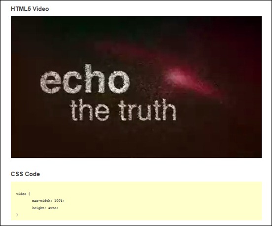
In this responsive web design tutorial, you will learn how to make embedded videos elastic (responsive) to browsers.
Build a Responsive Filterable Portfolio with CSS3 Twists – MORE INFO
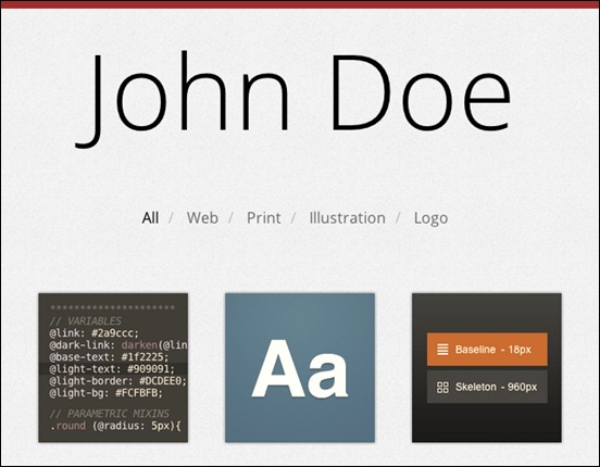
This tutorial will teach you how to inherent visual appeals of filterable portfolios using straight-forward markup, CSS3 and a little bit of jQuery.
How to Build a Responsive Thumbnail Gallery – MORE INFO
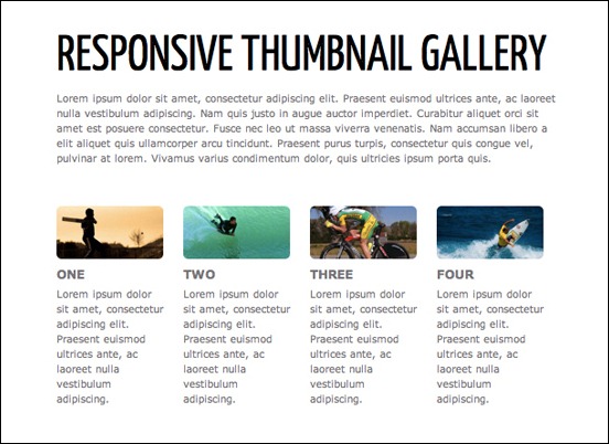
In this tutorial you will learn how to build a responsive thumbnail gallery.
Responsive Content Navigator With CSS3 – MORE INFO

This tutorial will show you how to create a content navigator with CSS only.
Responsive Coming Soon HTML5 Page Tutorial – MORE INFO
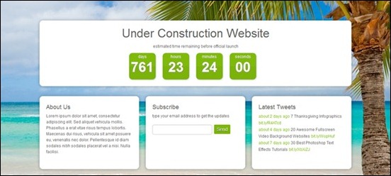
In this tutorial we’ll create a coming soon template, 100% responsive, that will help you keep your users informed while you are building a new website.
Convert Menu to Dropdown – MORE INFO
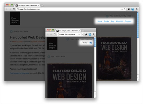
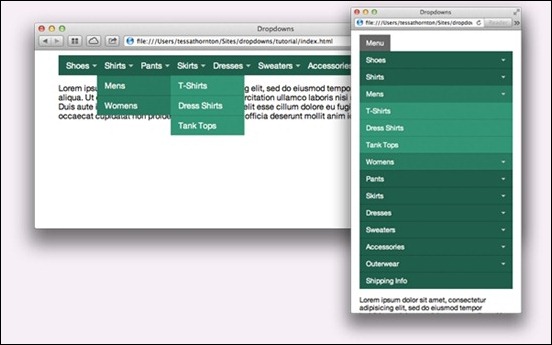
This tutorial will teach you how to convert your regular row of links into a drop down menu.
Build Responsive Site Week Designing Responsively Part 1 – MORE INFO

This tutorial will teach you the basics of creating a responsive website for mobile devices.
Create a Responsive Web Design with Media Queries – MORE INFO
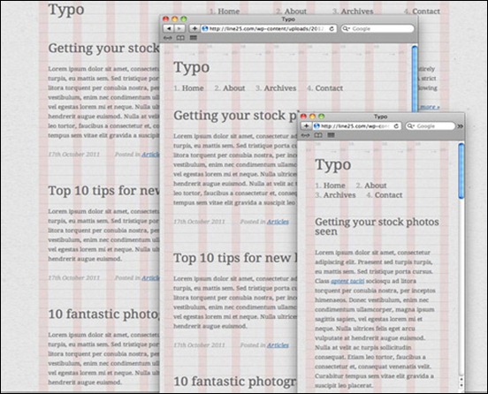
In this tutorial how to convert a previous WordPress theme design into a responsive layout, while taking into consideration the design’s original grid structure.
Beginner’s Guide to Responsive Web Design – MORE INFO
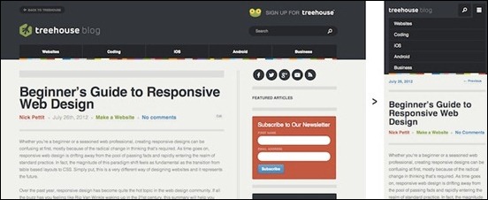
This tutorial is intended both for beginners and advanced web designers in creating mobile responsive websites.
Designing for a Responsive Web – MORE INFO
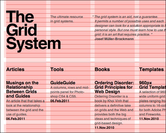
In this tutorial, you will learn the do’s and don’ts of designing websites for mobile responsiveness.
CSS Responsive Navigation Menu – MORE INFO
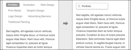
This tutorial will teach you how make a responsive toggle on hover menu which is more user friendly.
Build a Responsive, Mobile-Friendly Web Page With Skeleton – MORE INFO
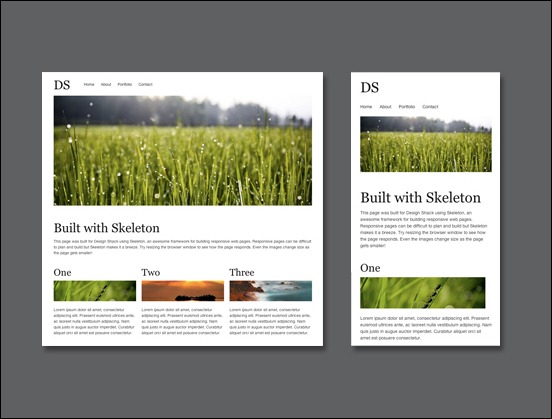
In this tutorial you will learn how to use a boilerplate called Skeleton to take the headaches out of designing and building a responsive web page.
How to Use CSS3 Orientation Media Queries – MORE INFO

This tutorial will focus on the orientation of media queries and also demonstrate on how to use it.
Adaptive Layout Media Queries – MORE INFO
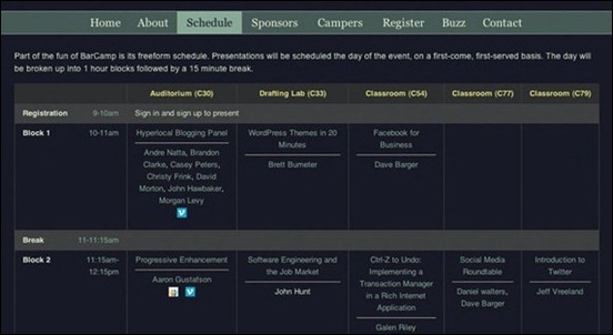
This tutorial will teach you how to create a beautiful website employing adaptive layouts and optimized for the latest mobile devices.
Responsive Images Experimenting with Context Aware Image Sizing – MORE INFO
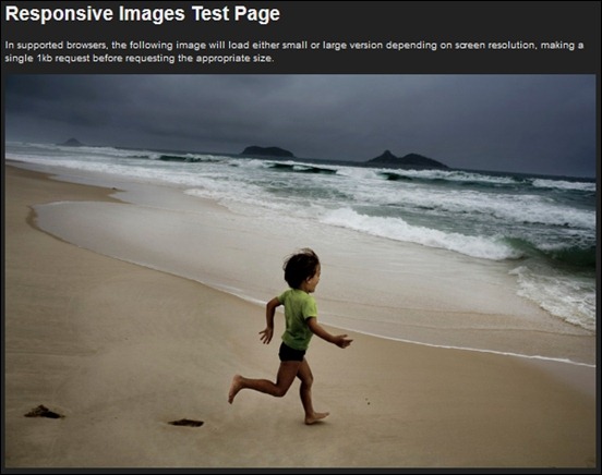
This tutorial will teach you how to deliver optimized, contextual image sizes for responsive layouts that utilize dramatically different image sizes at different resolutions.
Responsive Web Design: A Visual Guide – MORE INFO
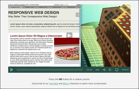
This tutorial shows how to build a mobile responsive site thru a video presentation. It covers all the basic things needed to get you started.
Elements of Responsive Web Design – MORE INFO

In this tutorial, an in depth discussion of the elements of web design is presented.
Responsive Web Nav – MORE INFO
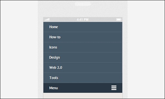
This tutorial walk you through on how to build a simple navigation from the ground using the CSS3 media queries and jQuery to display it in a small screen size like the smartphones properly.
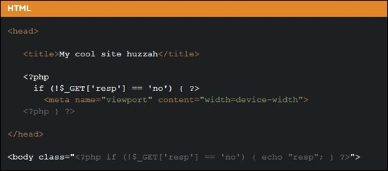
User Opt-out Responsive Web Design – MORE INFO
Responsive Design – MORE INFO
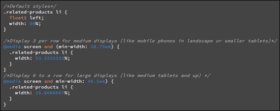
This tutorial is going to walk you through how to create an adaptive web experience that’s designed mobile-first
How to Use CSS3 Media Queries to Create a Mobile Version of Your Website – MORE INFO
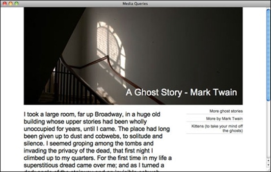
In this tutorial, you will learn how to convert an existing website into a mobile responsive website.
Handling Typography Responsive Design – MORE INFO
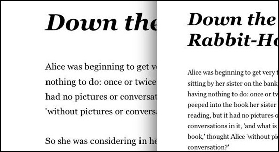
This tutorial covers how to effectively format font types to be responsive as well.
The Sparkbox Responsive Design Process – MORE INFO

A graphic tutorial about responsive web design process.
Big Menus, Small Screens: Responsive, Multi Level Navigation – MORE INFO
In this responsive website tutorial to responsive navigation, you will learn how to use an approach that can accommodate large, multi-level navigation menus using media queries and jQuery, whilst trying to keep markup simple and external resources minimal.
Responsive Horizontal Layout – MORE INFO

This tutorial will show you how to create a horizontal layout with several content panels.
Responsive Web Design – MORE INFO
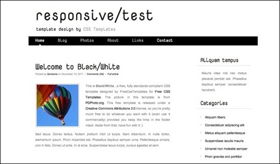
This responsive web design tutorial aims to show how to create a responsive design of a web page adaptable to different screen resolutions, and providing a concrete example.
Optimizing your emails for mobile devices With the @media query – MORE INFO
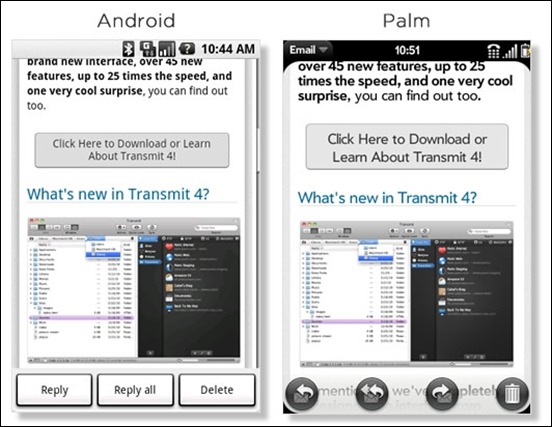
A quick tutorial on how to properly handle emails using the @media query.
Fluidgrids – MORE INFO

This tutorial pretty much discusses how to make grids fluid and resize according to the browser’s window.
Responsive Design – MORE INFO

This tutorial is about how to apply responsive design feature into your web layout.
Creating Responsive Stylish with CSS3 and HTML5 – MORE INFO
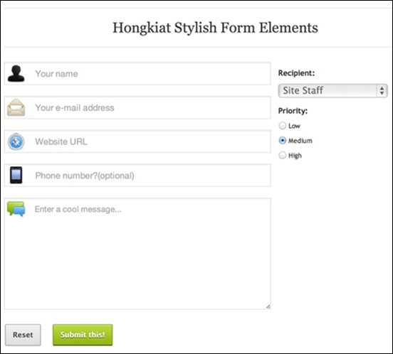
This tutorial provides a basic introduction on how to make responsive sites using HTML5 and CSS3.
5 Useful CSS Tricks for responsive Design – MORE INFO
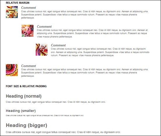
A tutorial of 5 most commonly used CSS tricks along with sample cases for coding responsive designs. They are simple CSS properties such as min-width, max-width, overflow, and relative value — but these properties play an important part in responsive design.
Responsive Web Design – MORE INFO

Working with Fluid Images in Dreamweaver CS6 – MORE INFO

In this tutorial, you will see how to manage fluid images integrated within the website using Dreamweaver CS6.
Lars is passionate about web design, web development, SEO, social media and loves to look into new technologies, techniques, tools etc. and to write articles for tripwire magazine readers.




It’s Too Good.Thanks Admin for share this 🙂
Thank you fore some usefull tips for Responsive design.