Contents
- mrcthms
- ghosthorses
- designdisease
- creativecan
- jasonweaver
- Mark Forrester
- webdesignerwall
- espiratecnologias
- sheenaoosten
- sweethatclub
- ribot
- solidgiant
- joshuaonesix
- Treehouse
- chasefarnum
- davidhellmann
- smashingmagazine
- studiopress
- soapmedia
- camptech
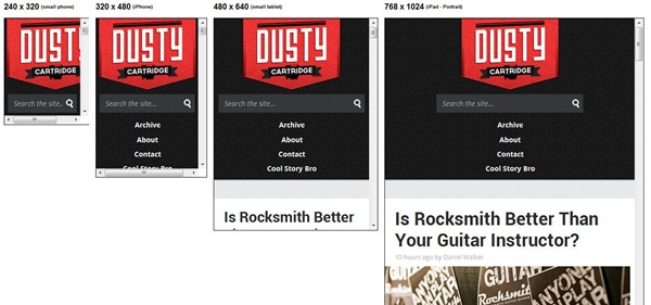
- dustycartridge
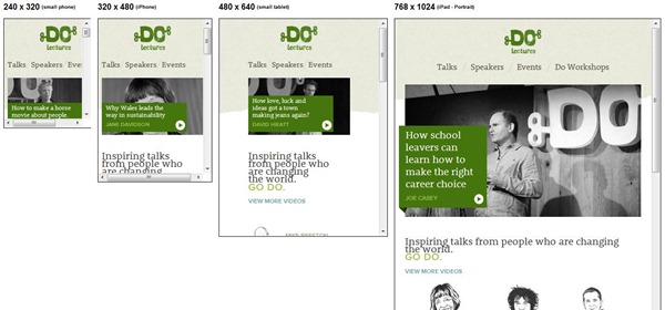
- dolectures
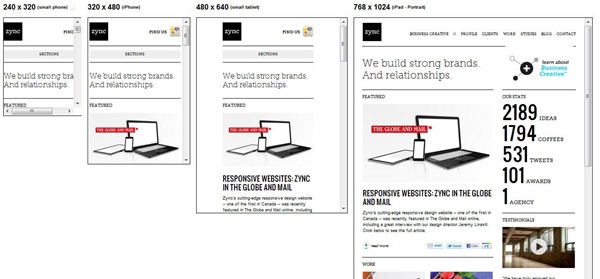
- zync
- staffanstorp
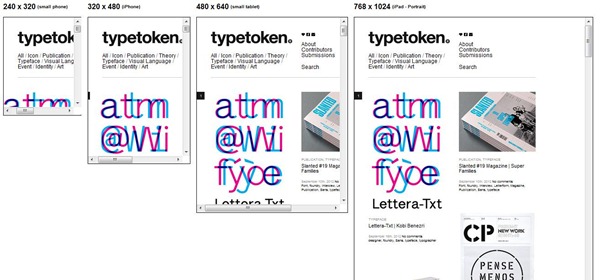
- typetoken
- ashwebstudio
- csswizard
- laufbild-werkstatt
- Studioimg
- bonnaroo
- Cardamomo
- Teegallery
- 3200 Tigres
- CSS Tricks
- Owltastic

If you are planning on making your website responsive and thus mobile-friendly, inspiration and knowledge about what others are doing is an important part of the process. This article presents a wide range of attractive solutions where responsive websites are developed using WordPress and some of the awesome themes and plugins available today.
One of the major trends in 2012 in web design is that websites should be mobile friendly and look great on any device whether it’s a laptop, an iPhone or a tablet. This is because of the rapidly growing amount of people who choose to access the Internet from a mobile device. Virtually everyone has a smartphone with good internet connection, and it is important for a serious website to provide a good user experience for all types of mobile browsing devices.
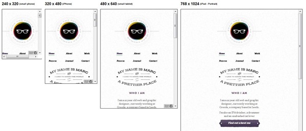
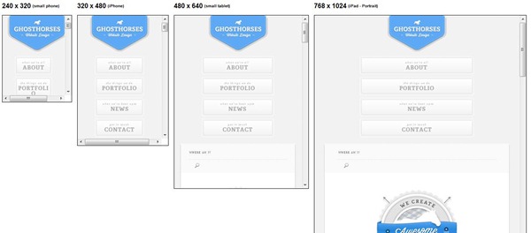
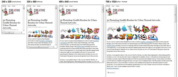
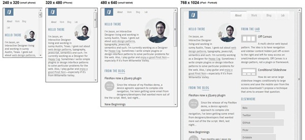
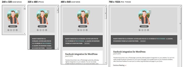
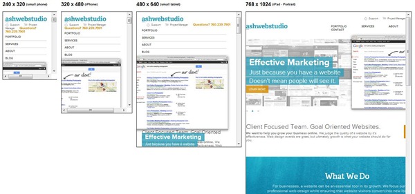
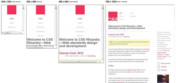
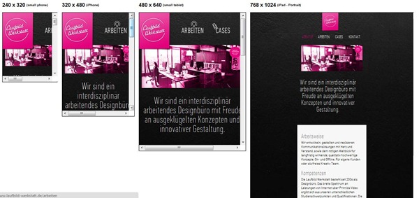
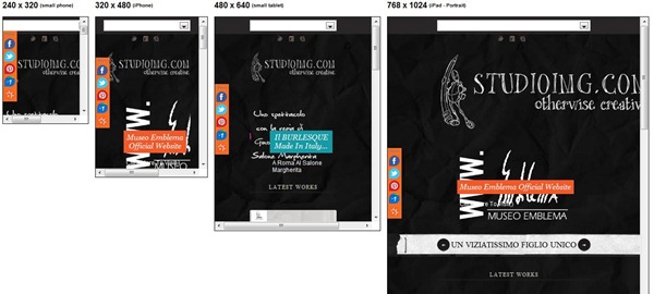
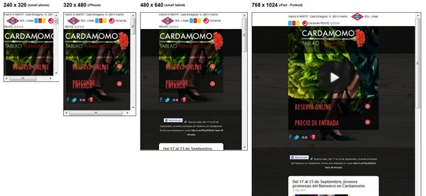
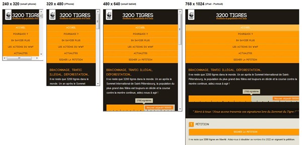
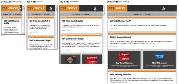
If you do not already have an attractive mobile version of your website, it is important to consider how your website should welcome visitors when they use a mobile device. There is a large mobile market that you should not ignore, and it’s not necessarily a huge task to get a mobile friendly website. You will find different options to consider in the process, and you will have to take decisions in terms of both design and technical aspects. Have a look at these inspirational examples of responsive WordPress websites to get started. By the way, the images in this post is created using one of the useful responsive tools available. Some of the examples do not show the right picture and you are therefore encouraged to see websites in reality on mobile devices.
[exec]$filestr = file_get_contents(‘http://www.tripwiremagazine.com/googleadsensebelowmoretag.inc’);echo $filestr;[/exec]
mrcthms
ghosthorses
designdisease

creativecan
jasonweaver
Mark Forrester
webdesignerwall

espiratecnologias

sheenaoosten

sweethatclub
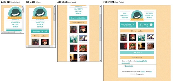
ribot

solidgiant
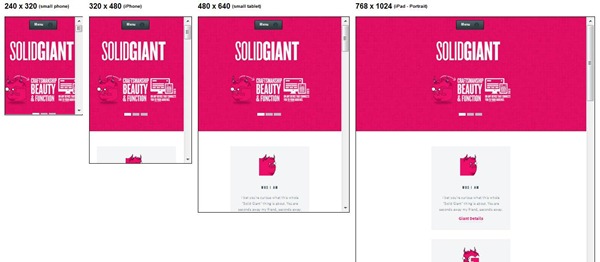
joshuaonesix
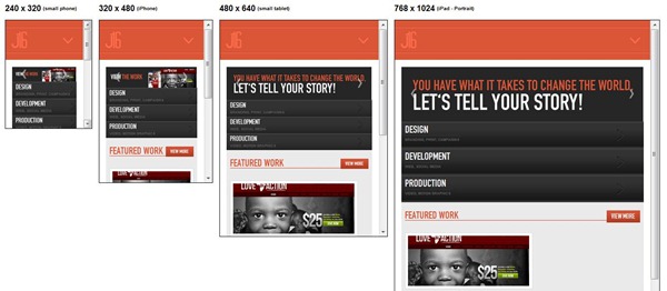
Treehouse

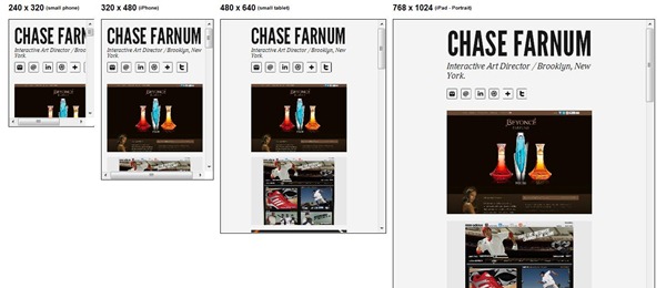
chasefarnum
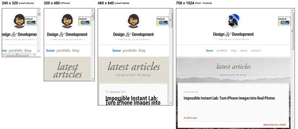
davidhellmann
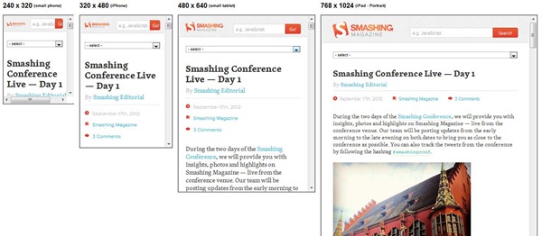
smashingmagazine
studiopress

soapmedia

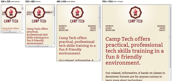
camptech
dustycartridge
dolectures
zync
staffanstorp

typetoken
ashwebstudio
csswizard
laufbild-werkstatt
Studioimg
bonnaroo

Cardamomo
Teegallery

3200 Tigres
CSS Tricks
Owltastic
![owltastic[3] owltastic[3]](http://www.tripwiremagazine.com/wp-content/uploads/2012/09/owltastic3_thumb.jpg)
Now, Please leave a comment and tell us which responsive website you like best or if you know other nice responsive website for inspiration.
Anders is Co-founder of Tripwire Magazine. He is into WordPress topics, Web design, Web-development and also interested in SEO and Online Marketing. He has started Splashmagazine.com and he’s also writing for other blogs. Anders is a passionate blues musician and a family-man, as well.


Having a mobile is a major trend for websites now as most of the people are searching and buying products online with the use of mobile phones.
While I am reading this post, I really learned a lot. This help me to widen my knowledge about what is your theme is. Thanks a lot for this information.
wow,,,,Really nice collection , thnx for sharing……
mostly i like designdisease publish a high profile web and graphic design blog with a focus on aesthetics, tutorials, inspiration, the web, and the myriads of topics that fall in between.
Manoj Rawal
Hi Manoj – thanks for your feedback. I’m glad you like it.
Kind regards
Andy