Using the color red for your design can be a great move. If you choose the right shade of red in the perfect spot, it has the power to grab attention.
Red is known to be associated with passion, energy, and sensuality, but remember, it must be used with care. In the wrong shade or used inappropriately, red can be a disaster. Below you will find some amazing examples of how red should be used in design.
Hopefully they will inspire you to greatness in your own use of red hues, whether for posters, business cards, or a website design minimal WordPress theme.
[exec]$filestr = file_get_contents(‘http://www.tripwiremagazine.com/googleadsensebelowmoretag.inc’);echo $filestr;[/exec]
Advertising
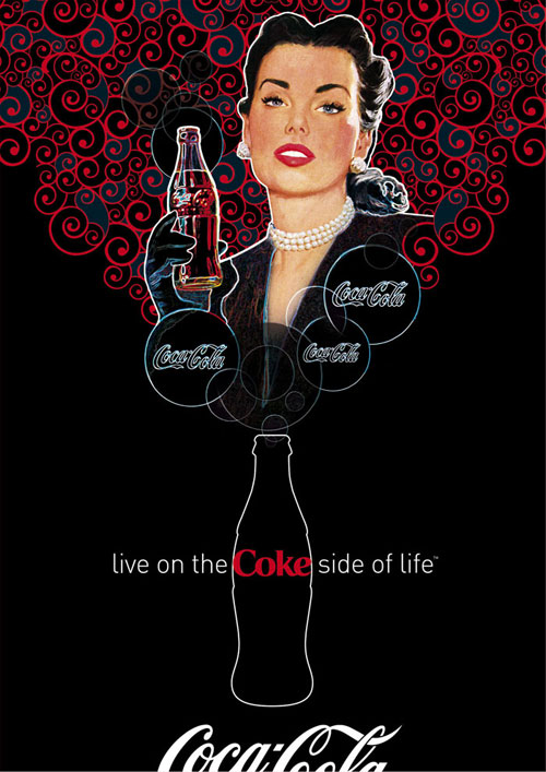
Elegant Coca Cola
A beautiful woman is always a nice way to accent the color red, but this ad is made even more brilliant by the elegant combination of red swirls on a black background.
Valentine Coca Cola
 The pink and lighter red tones in this poster makes for a perfect Valentine ad.
iPod Shuffle
The end result of this tutorial shows just how eye-catching a red product can be when accented well with toned down background.
Kappa Shoes
 This dripping effect in the color red is definitely a head-turning object.
Ferrari
 An illustration of a woman’s vivid red hair stands out well against an all black background in this simplistic design.
Ads by Mohanad Shuraideh
 This collection of ads Shuraideh made for Burjuman shows just how stunning a red dress can be on a beautiful woman set against a dark background.
Sony Vaio
 The explosion of red coming from the laptop and sports car make for a very eye-catching advertisement.
Beyonce L’Oreal Lipstick
 One of Beyonce’s provocative ads for L’Oreal’s Color Riche lipstick; the way the lipstick matches the dress color perfectly is stunning.
Alexander McQueen
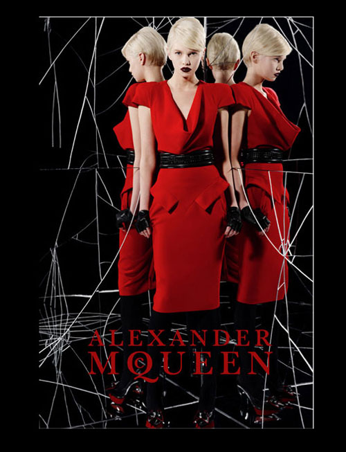 Once again, a red dress on a beautiful woman with a dark background is mysteriously elegant, especially with the incredible use of mirrors in this ad.
Websites
Helveti-tweet
 The gradient background helps to tone down the red background; no other effect is necessary since the red color alone is enough. The white logo and font stand out nicely against the background.
Jon Wallace Design
 This beautiful website design is clearly the work of a pro. The shade of blue contrast nicely with this shade of red.
Motion Extreme
 A brilliant flash site, this page displays a red planet, red logo, red meteor, all in various yet complimentary shades of red.
Nuevo Aurich Buenos Dias
 The red wine, red peppers, red sauces, red menu, and red headline in combination with the browns and a few whites and greens thrown in are very eye-catching and mouth watering.
Margot Blanche
 This beautiful site for this pop artist proves that certain shades of red in combination with black create an ambiance of mystery and elegance.
Stampede Design
 The smoky red effect is gorgeous on this site, but the only drawback is that the text is hard to see.
Business cards
Red with White Text
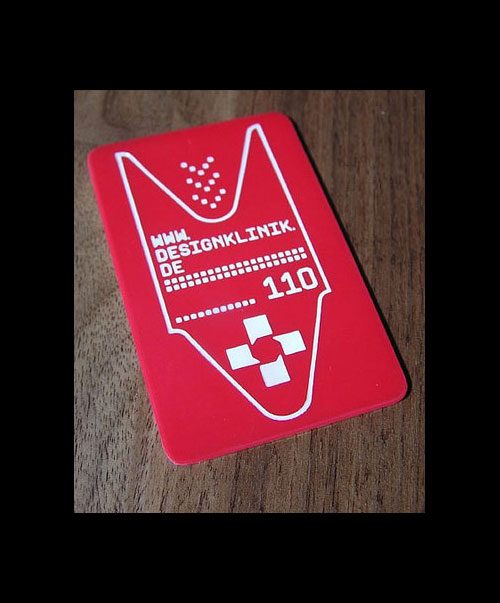 The white design and text stands out well against an all red background.
Old Red Hat Letterpress
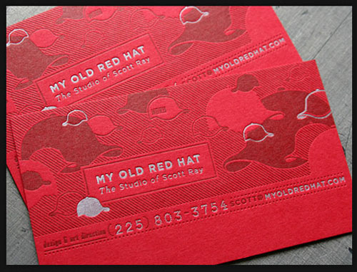 The silver letterpress on this red background creates quite the professional look.
Allysson Lee
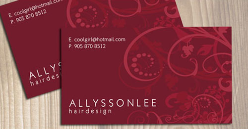 In a maroon shade of red, these business cards with the swirl designs look quite feminine.
Ninja BTL
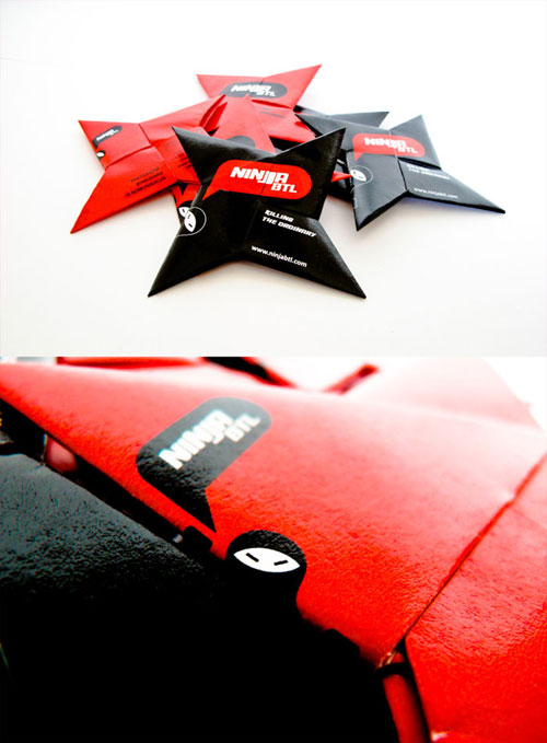 The red and black colors accent the ninja star shape of these unique business cards perfectly.
Red Photography
Red Wine
 The splashes of the red wine show up vividly against a light background.
Red Parasol
 The red color of the parasol can have different meanings in this photograph. Looking at this picture, one wonders if owner of the sexy pair of legs is merely asleep or dead?
Red Balcony
 A red balcony with red flowers against a cloudy sky gives this photograph both an ominous and exciting look and feel.
Red Trees
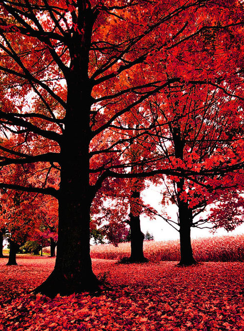 The red leaves contrast well with the black trunks of the trees in this beautiful photo.
Blue Bike and Barn
 A striking photo by Joseph Sorrentino, the blue of the bike contrasts nicely with the red barn.
Paint it Red
 The model’s red hair, lips, finger nails, and dress contrast beautifully with her white skin tone.
Red Memories
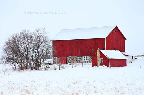 The red of the barn is striking against the white snow, very memorable as the photographer points out.
Model with Beautiful Makeup
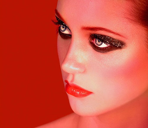 The overall red tone of this photograph is brilliantly done and really draws attention to the model’s brown eye makeup.
Go Red!
Alex Naz is a professional writer with a proven track record. He is a creative blogger who is passionate about web design, SEO and web development. He is also a family man and has a passion for the outdoors.




Hai hallo i like all red design is absalutly good is very support for my another visulas
iam a freelance designer in south india.
Red has always outstanding effect!!!
This is really good. It really helped me with my homework